Back Home

Designing a Seamless Member Experience Through a Unified Digital Member Hub
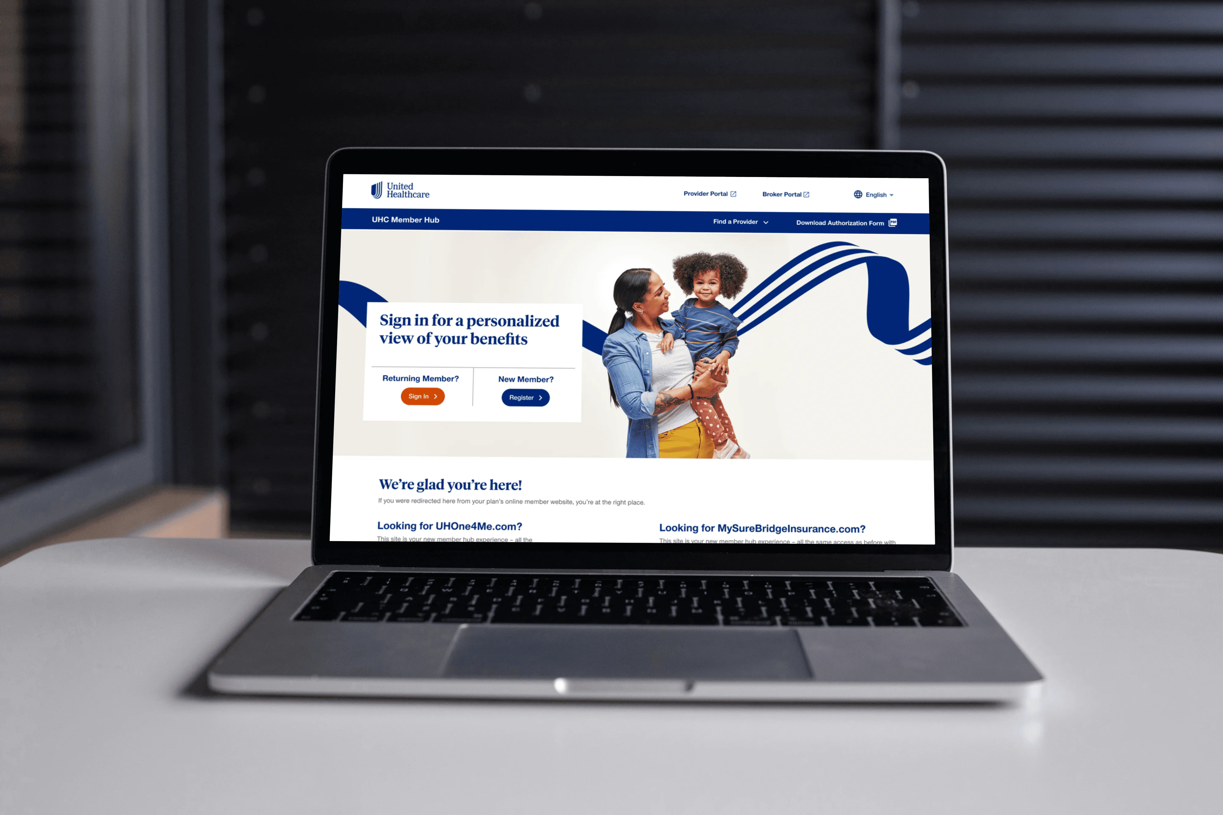
Creating a single portal experience that provided the end users with all their plan information for two separate lines of business under one user ID. Therefore bringing down the high call volumes for customer support calls by allowing users to fulfill various self service transactions.
Problem
Having two separate portals for two different lines of business, creating a difficult user experience that made it difficult to access all insurance information.
Solution
Creating a single portal experience that provided the end users with all their plan information for two separate lines of business under one user ID. Therefore bringing down the high call volumes for customer support calls by allowing users to fulfill various self service transactions.
User Research
User Personas
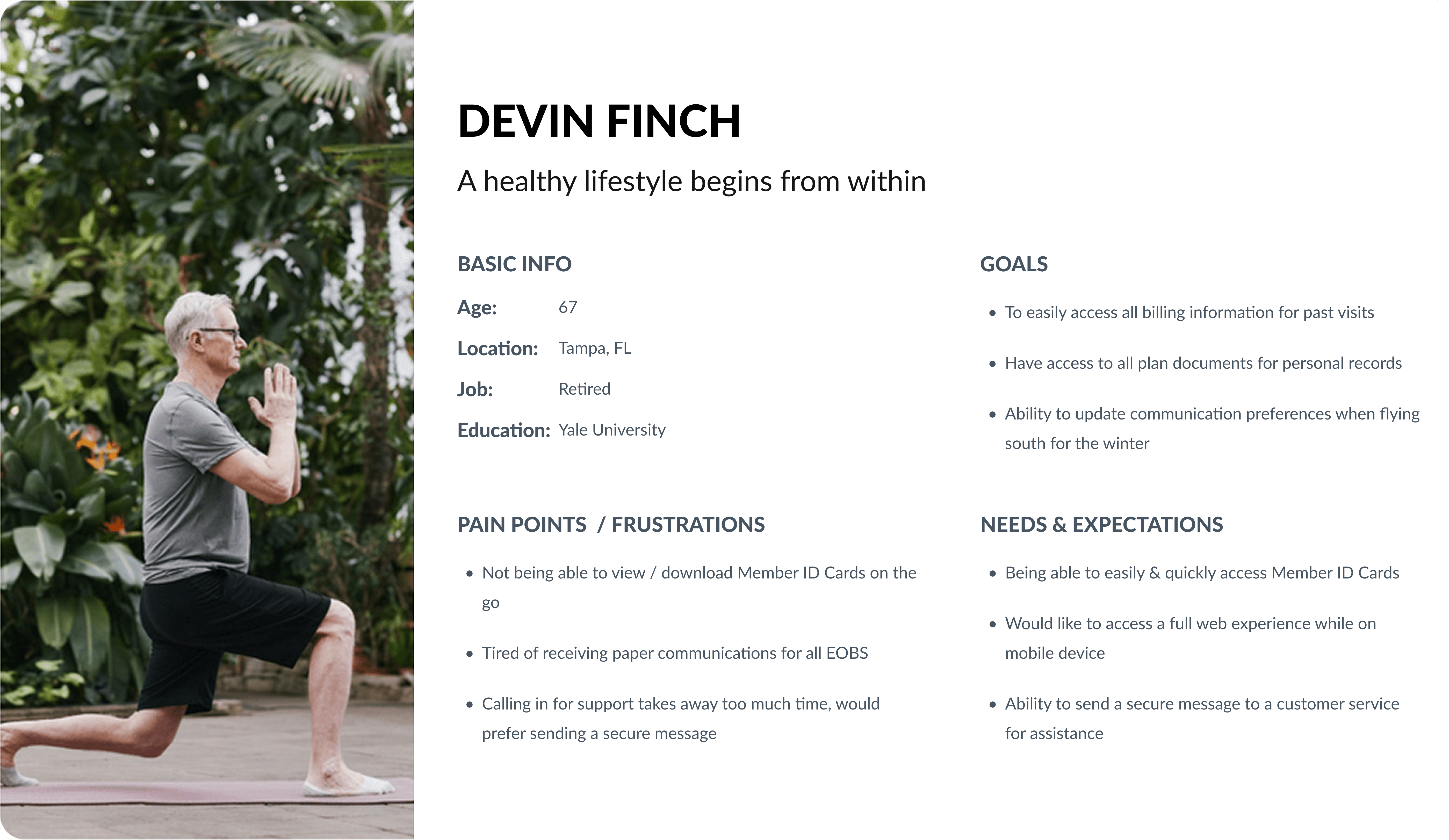
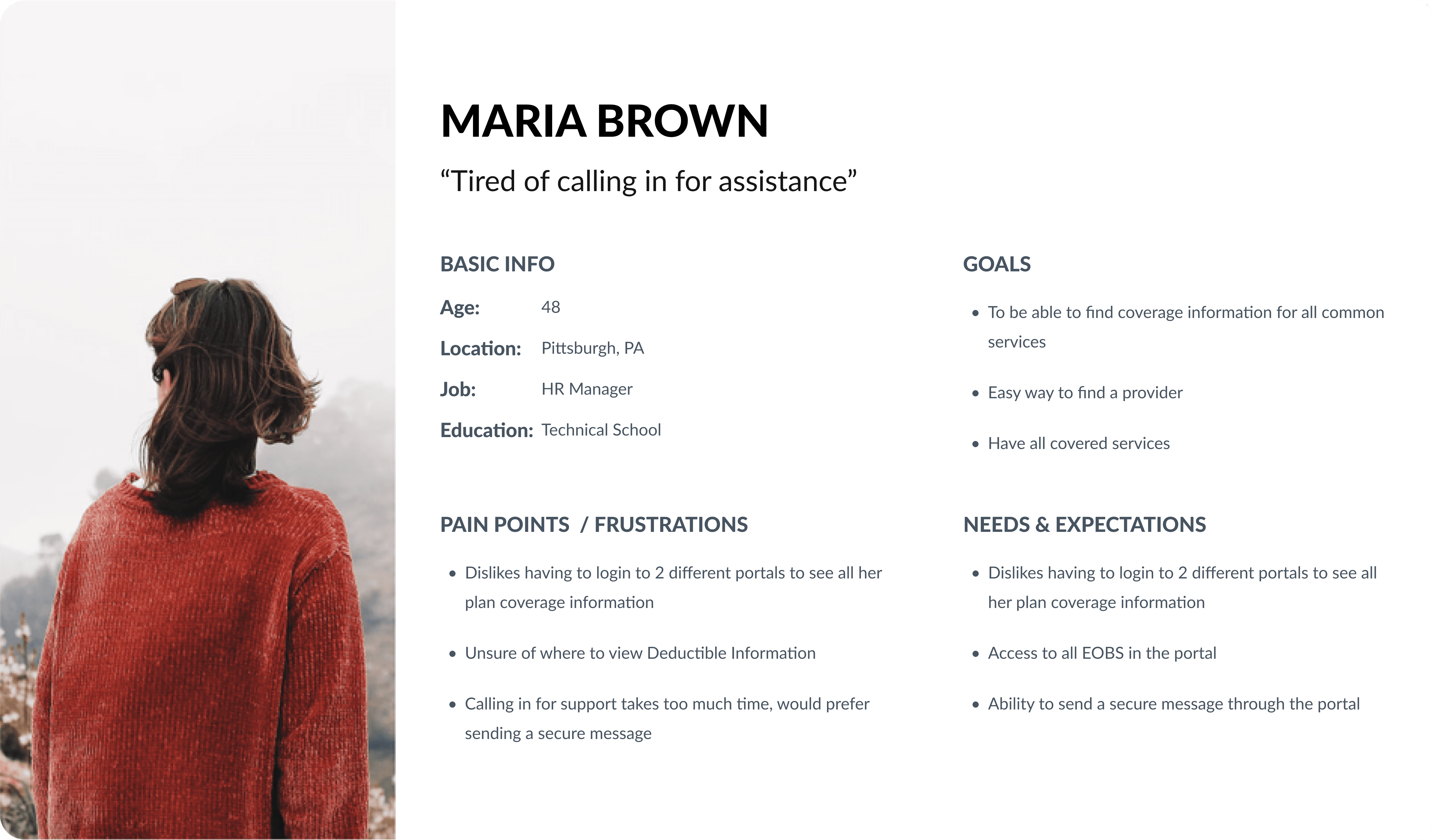
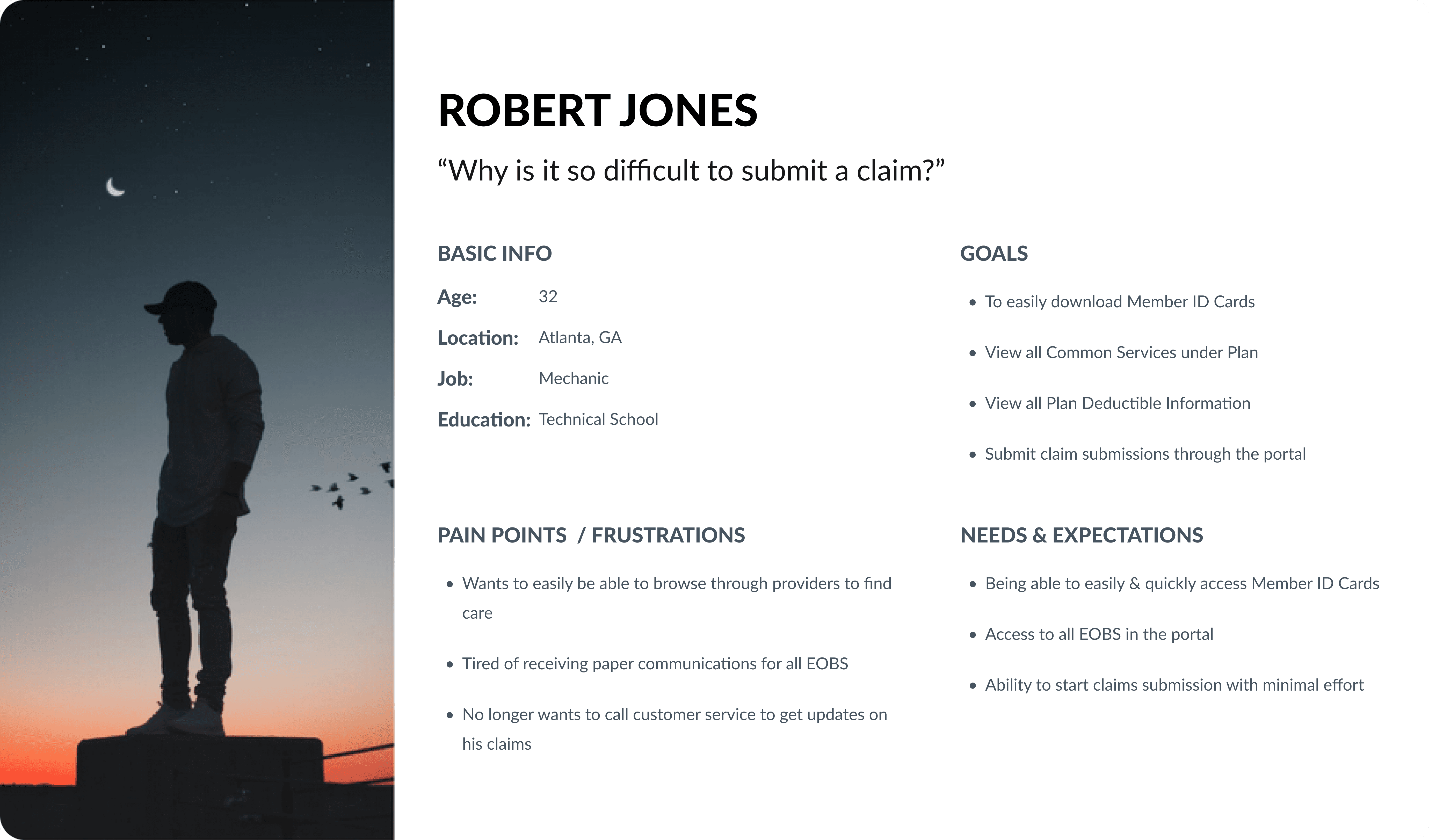
To ensure the redesigned UHC Member Hub met the real-world needs of its diverse userbase, three distinct user personas grounded in user data, support call insights, and common usage scenarios were created. Each persona represents a key segment of the membership population, ranging from working professionals to retirees, helping to identify common friction points and unmet expectations.
These user personas were central to driving design decisions around the information architecture, self-service functionality, and mobile usability, ensuring the final experience is intuitive and efficient across Web and Mobile for all users.
Information Architecture
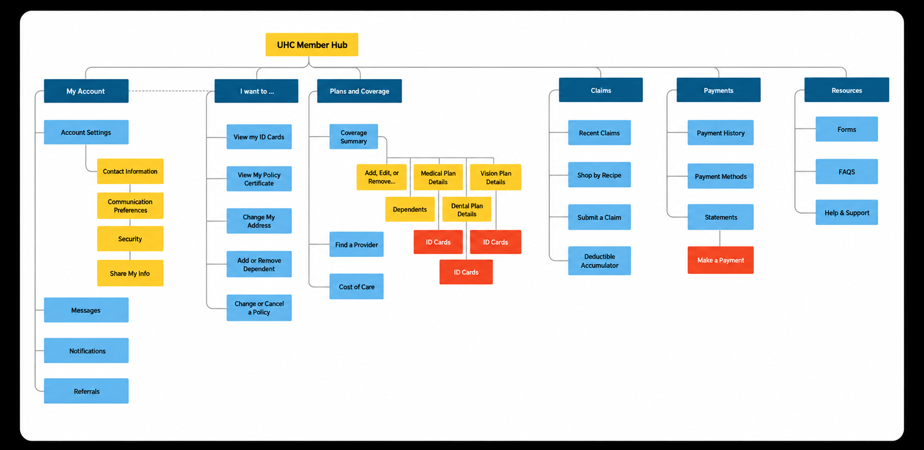
The original structure was fragmented across multiple portals, causing confusion and user friction. To resolve this, the structure was revamped to consolidate key tasks such as viewing ID cards, managing plans, and submitting claims, into a single, intuitive hub.
Content was reorganized around user intent to streamline navigation ad improve discoverability. This new structure for the Information Architecture reduced redundancy, supported faster self-service, and helped reduce support call volume.
Tree test study objective
USability Testing Metrics
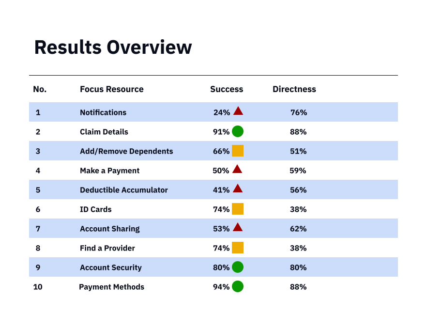
Following the tree testing phase, we conducted a usability test to evaluate how effectively users could complete key tasks within the updated information architecture. Two key performance metrics were tracked:
Success – Measures whether participants ultimately arrived at the correct destination, regardless of their path.
Directness – Measures whether participants navigated directly to their answer without backtracking, highlighting clarity and confidence in the navigation structure.
Our target thresholds were:
Success: 80% or higher
Directness: 65% or higher
Key Findings:
High-performing areas included:
Claim Details – 91% success / 88% directness
Payment Methods – 94% success / 88% directness
Areas needing refinement:
Notifications – 24% success despite 76% directness, indicating a labeling or placement issue.
Deductible Accumulator & Add/Remove Dependents – Lower directness scores (56% and 51%) suggest uncertainty in pathfinding.
These insights guided final adjustments to labeling and grouping before UI design, ensuring the most commonly used features were more intuitive and accessible.
UX Design
loW-fIDELITY DEsktop wIrEFRAMES
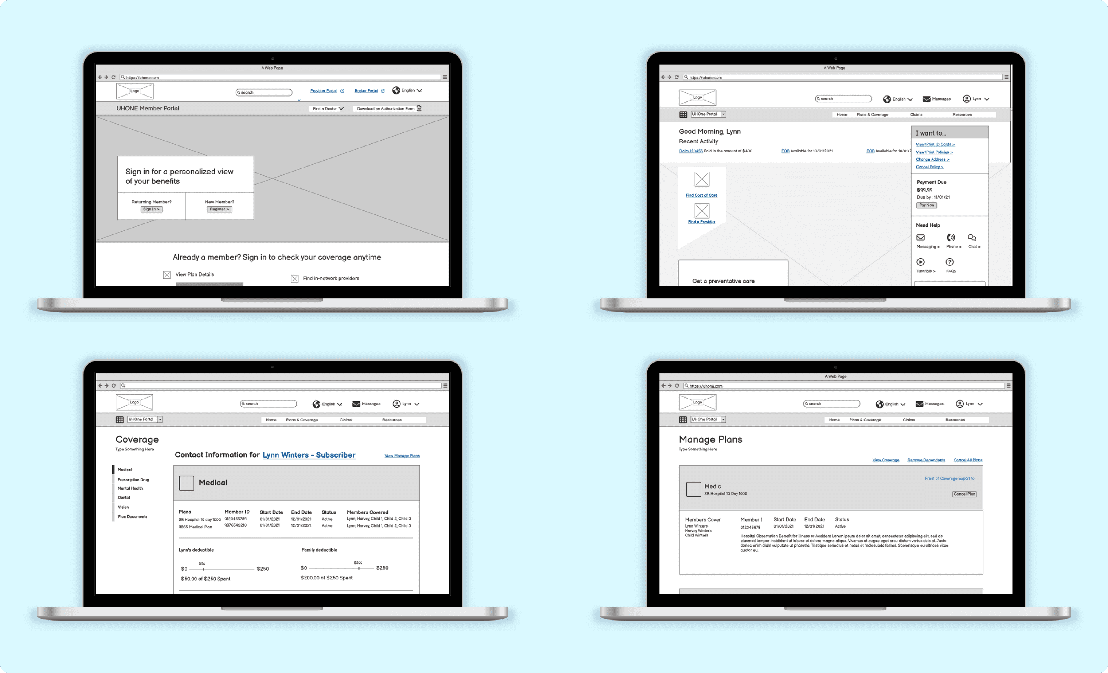
The initial wireframes were created using Balsamiq to explore key layout structures and user flows in a low-fidelity format. These early concepts served as a foundation for discussions with stakeholders, enabling rapid iterations during the ideation phase.
Following internal alignment, we conducted two rounds of usability testing using a clickable prototype to validate the structure and gather feedback. The insights collected helped refine navigation patterns and task clarity before progressing to high-fidelity design.
High-fIDELITY DEsktop wIrEFRAMES
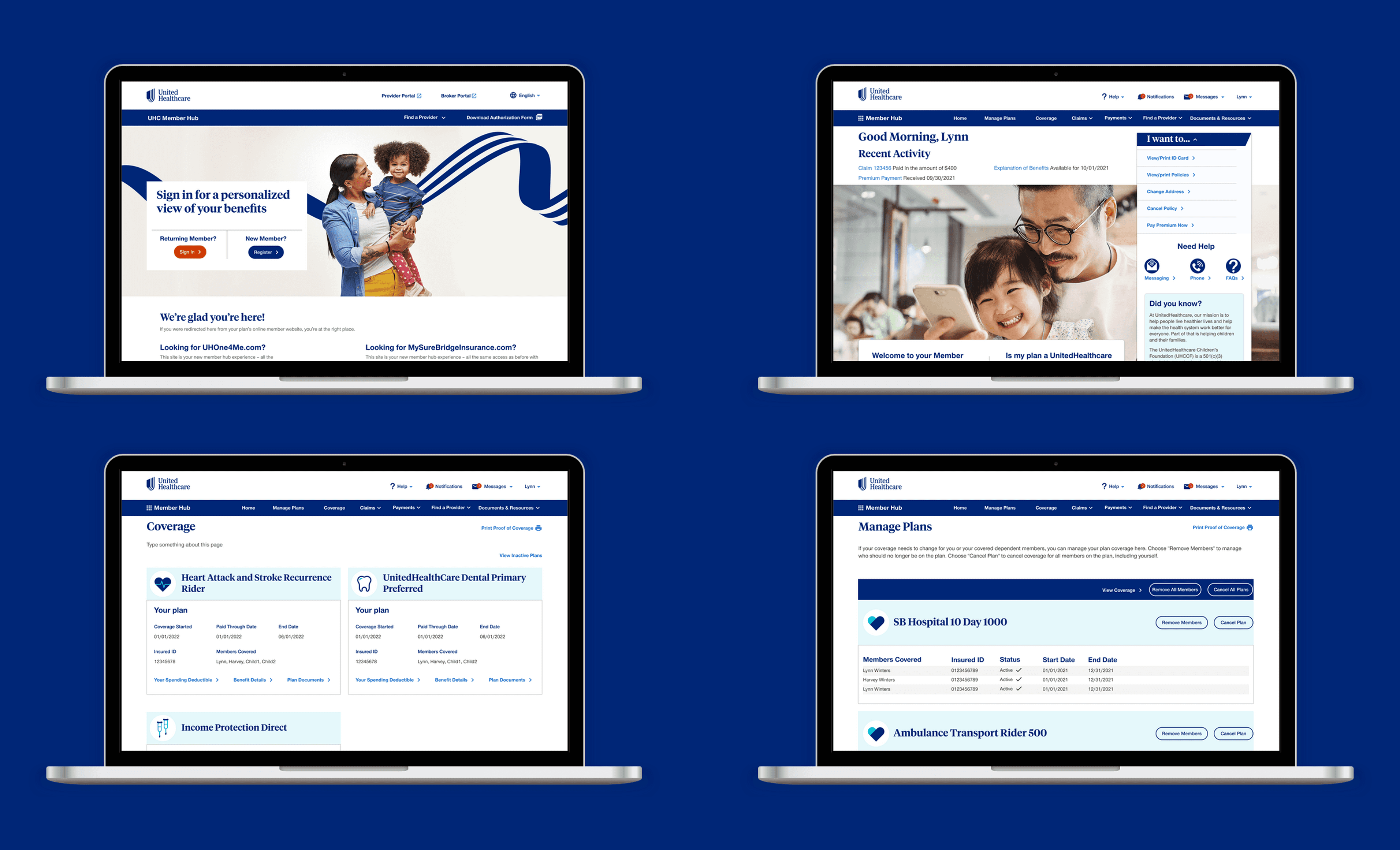
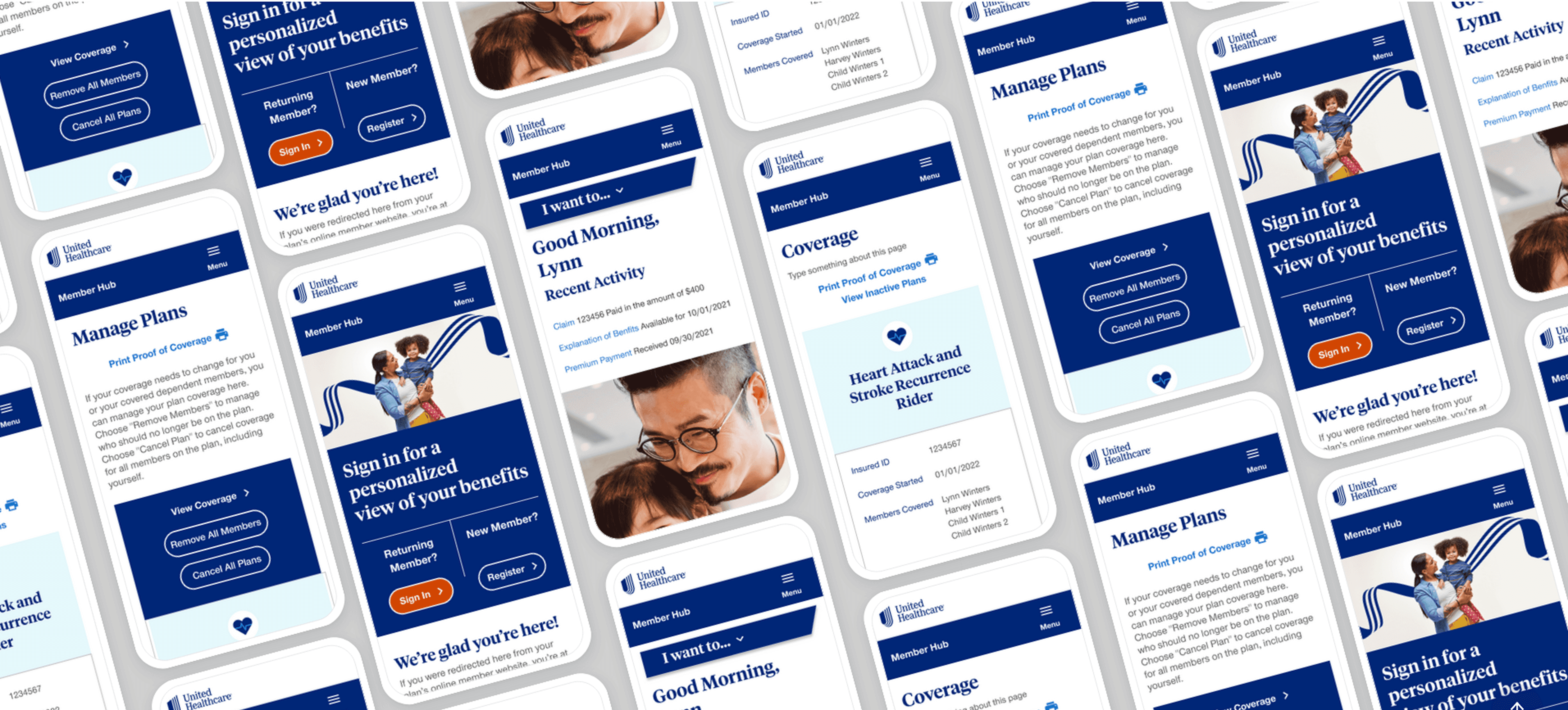
The high-fidelity wireframes were initially created in Sketch and later refined in Figma to align with updated brand guidelines and visual standards. These designs introduced full layout structure, typography, color, and component behavior to accurately reflect the intended user experience.
Building on insights from earlier usability testing, multiple iterative rounds were completed to refine content hierarchy, navigation patterns, and interaction details, ensuring the experience was polished, intuitive, and ready for final development handoff.
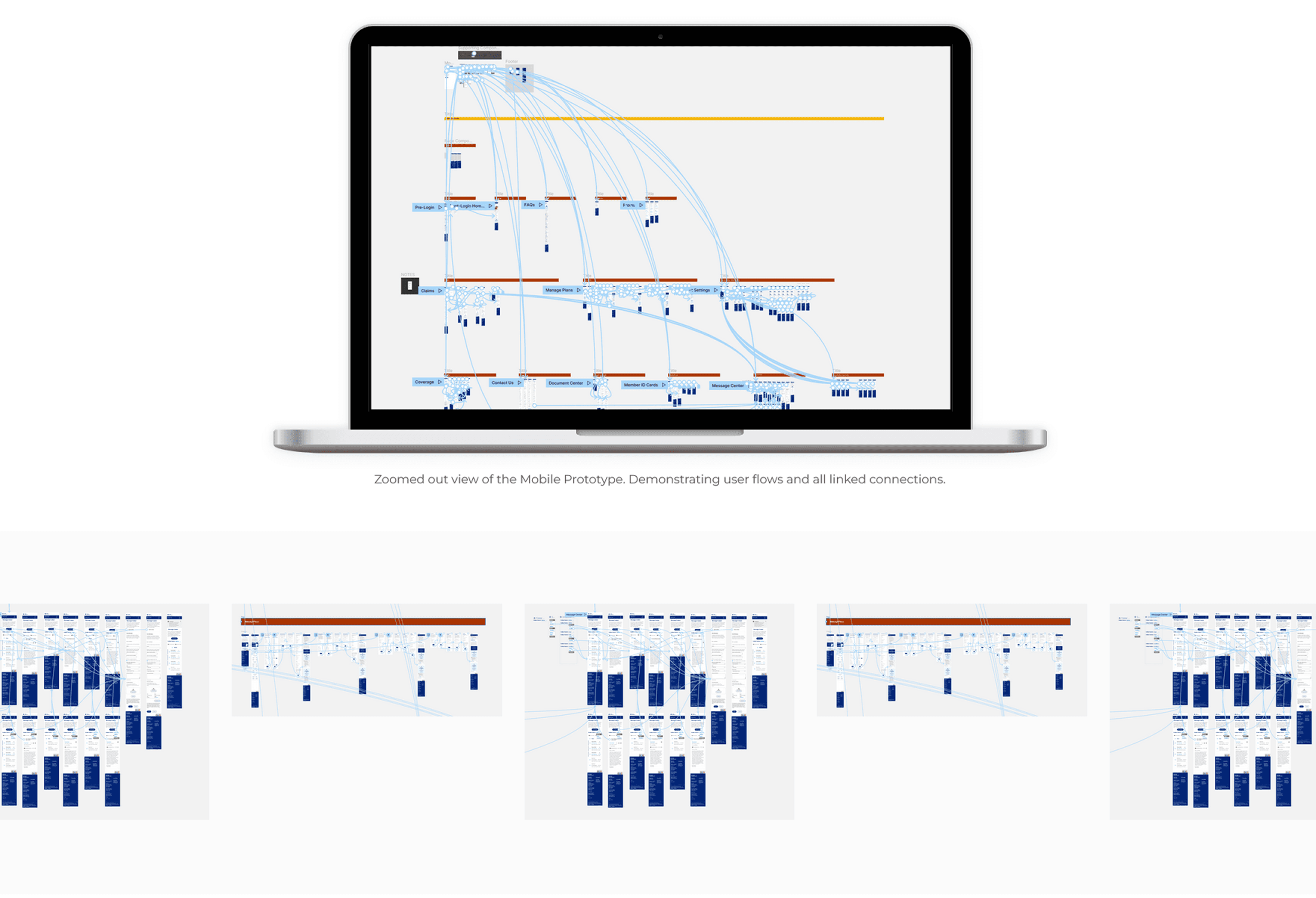
Figma PRototypes
All prototypes that were used for the usability studies were created in Figma.